5 Explainable AI
5.1 Introduction: Why Explainability Matters
5.1.1 Brief definition of XAI
The evolution of AI marks a clear shift from early, transparent algorithms to modern, highly complex models. Foundational methods such as K-means or decision trees offered inherent interpretability, with their outputs directly linked to logical rules or proximity measures, concepts easily understandable by the human mind.
By contrast, the past decade saw the rise of deep learning and large transformer architectures, starting with the 2019 release of GPT-2 variants exceeding 1 billion parameters (Radford et al. 2019), which introduced a new challenge.
The scale and complex, non-linear interdependencies of models with hundreds of billions of parameters make their decision-making processes opaque, a limitation widely referred to as the “black box” problem.
Therefore, a new field of study, called eXplainable AI (XAI), emerged with a set of methodologies designed to address this opaqueness. It is defined as a collection of techniques that provide “the ability to explain or to present in understandable terms to a human” (Doshi-Velez and Kim 2017). These techniques enable users to comprehend, interpret and thus trust the outputs of those complex algorithms. The core justification for XAI lies in the human need for evidence and accountability, a principle that is essential for the ethical deployment of AI in high-stakes domains.
5.1.2 Key Distinction: Explainability vs Interpretability
While often used interchangeably, a commonly used distinction separates the concepts of interpretability and explainability, as in the work of Rudin in 2019 (Rudin 2019), who advocates for one approach over the other.
Interpretability refers to the degree to which a human can understand the underlying mechanics of a machine learning model. It answers the question of “how” the model works. Models with high intrinsic interpretability, such as linear regression or decision trees, reveal their rationale directly through their structure.
Explainability, on the other hand, refers to the capacity to provide a human-understandable justification for a specific decision or prediction made by a model. It answers the question of “why” a particular outcome was reached. This is crucial for complex, opaque models where the internal workings are not readily visible. The goal of explainability is to translate the model’s opaque decision into a comprehensible narrative.
Other works do not make this distinction and use the term “interpretability” or “explainability” to encompass both concepts (Murdoch et al. 2019; Molnar 2025), emphasizing that what is considered interpretable or explainable can vary depending on the context and the audience.
However, since Explainable AI is the more commonly used term in the literature, and in this guide we are mainly focused on providing explanations for complex models, we will use it as an umbrella term to refer to all the methods that aim to provide explanations of outcomes given by a complex ML model. We therefore use the term interpretability only to refer to the intrinsic interpretability of a model, that is, to the degree to which a model’s structure allows for human understanding without the need for additional explanation techniques.
5.1.3 Importance of XAI in legal, ethical, and safety-critical domains
“For the things we have to learn before we can do them, we learn by doing them, e.g. men become builders by building and lyre players by playing the lyre.”
— Aristotle, Nicomachean Ethics, Book II, Chapter 1 (1103a)
While modern AI learns by “doing” (e.g. through large-scale pre-training), its application in high-stakes fields such as medicine, finance, or autonomous systems falls into the category of things we must know before we can act. In such contexts, every decision can carry significant consequences on people’s lives. Therefore, AI outputs must be comprehensible to end-users, allowing them to challenge, validate, or contest the decisions.
This requirement is best illustrated across the following domains. First, in criminal justice, the COMPAS algorithm, widely used in the U.S. to predict recidivism risk, was found to exhibit racial biases (Angwin et al. 2016), without leaving affected individuals the possibility to understand or contest the score assigned to them. Second, in healthcare, an AI model flagging an anomaly in an MRI scan is of little clinical value if it cannot be verified that the prediction is grounded in a detected lesion rather than an imaging artifact (Zech et al. 2018). Finally, in the European Union, the requirement has already been codified: Article 22 of the EU’s GDPR restricts decisions based solely on automated processing that produce significant effects on individuals; Recital 71 explicitly calls for the right to obtain an explanation of any such decision (Regulation (EU) 2016/679 of the European Parliament and of the Council 2016).
5.1.4 Overview of explanation types
Explanations are often categorized based on their scope and nature:
Intrinsic vs. Post-Hoc:
- Intrinsic models are those whose structure is inherently interpretable (e.g., linear models, decision trees).
- Example: A spam filter (e.g., a decision tree) that flags an email because it contains the words “free,” “winner,” and “click here”; the rule is directly readable from the model.
- Post-Hoc methods are applied after a complex model has been trained to generate an explanation for its behavior.
- Example: A neural network classifies a movie review as negative; SHAP (see Chapter 2 — SHapley Additive exPlanations) is then applied to show that the word “boring” was the single biggest driver of that prediction .
Global vs. Local:
- Global explanations aim to describe the overall behavior and decision boundaries of a model.
- Example: Across thousands of predictions, a feature importance chart shows that a sentiment model relies heavily on exclamation marks and superlatives to detect positive reviews.
- Local explanations focus on providing a justification for a single, specific prediction.
- Example: A photo of a dog is misclassified as a cat; a saliency map shows the model fixating on the pointy ears and ignoring the body entirely.
Model-Specific vs. Model-Agnostic:
- Model-Specific techniques are designed to work only with a particular class of models.
- Example: CAM-like methods are designed only for CNNs, as they rely on spatial feature maps from convolutional layers.
- Model-Agnostic techniques can be applied to any machine learning model, regardless of its internal architecture.
- Example: LIME works by hiding parts of an image (e.g., blocking out the background) and observing how the model’s confidence changes; it can do this whether the model is a decision tree or a deep network.
Counterfactual vs. Contrastive:
- Counterfactual explanations answer the question: “What is the smallest change to the input that would alter the model’s prediction?”
- Example: “The movie review was classified as negative. If ‘boring’ had been removed, the model would have predicted positive.”
- Contrastive explanations focus on “why this prediction rather than another one?”
- Example: Two photos of skin lesions look nearly identical to a human, but the model flags one as malignant; a contrastive explanation pinpoints the subtle difference in border irregularity that drove the different predictions.
5.1.5 Optimizing AI Models on European Infrastructure and eXplainable AI
In recent years, in the European Union there has been a strong push for responsible AI development, emphasizing the importance of transparency and accountability. The EU’s regulatory framework, including the General Data Protection Regulation (GDPR) and the AI Act, underscores the necessity for some form of explainability in AI systems, particularly those deployed in high-stakes environments. In the context of the AI Act, for example, even though the current explanation methods still need to improve in terms of robustness and reliability, XAI methods can, if properly implemented, “support human oversight and increase transparency as required by the AI Act” (Panigutti et al. 2023). Similar requirements are also being considered in other regulatory frameworks around the world, such as the proposed United States’ Algorithmic Accountability Act and various initiatives in other jurisdictions such as the AI Governance Guidelines in India, or the Interim Measures for the Management of Generative Artificial Intelligence Services in China. Legal requirements are not the only driver of the need for explainability. In an era where AI systems are increasingly integrated into our daily lives, users demand transparency and accountability from the technologies they interact with, and companies recognize that providing explanations can enhance user trust and acceptance of AI systems. Therefore, companies, organizations, and institutions around the world are increasingly recognizing the importance of explainability in AI, not only to comply with legal requirements but also to build trust and ensure ethical use of AI technologies.
The above-mentioned legal and user demands drive organizations to prioritize explainability when optimizing AI models on European infrastructure. By designing models with explainability in mind, developers can enhance the transparency of AI models, making them more accessible and accountable to a wider audience, while also aligning with ethical standards. In addition, some explanation techniques can be computationally intensive, and being able to efficiently utilize them on European infrastructure can help ensure that they are practical for real-world applications. This is particularly important in scenarios where real-time explanations are required, such as in healthcare or autonomous driving, where timely insights can be critical for decision-making.
5.1.6 Guide Structure
Chapter 1 — Gradient-Based Methods: Covers post-hoc attribution techniques that leverage model gradients to highlight which input regions drive a prediction. Discusses CAM, Grad-CAM, and Grad-CAM++ for spatial heatmaps in CNNs, Integrated Gradients as an architecture-agnostic method with axiomatic guarantees, and SmoothGrad as a noise-reduction wrapper applicable on top of any gradient-based method.
Chapter 2 — Perturbation-Based Methods: Covers methods that probe model behavior by systematically modifying inputs. Presents Permutation Feature Importance and ICE plots as global and instance-level diagnostics, LIME and RISE as local approximation approaches, and SHAP as a game-theoretic framework that unifies local and global attribution with formal axiomatic guarantees.
Chapter 3 — Example-Based Methods: Covers methods that explain predictions through reference to training data rather than input features. Presents Prototypes (MMD-Critic) and ProtoPNet for identifying representative examples, and Influence Functions for tracing which training points most shaped a given prediction — useful for data auditing and regulatory accountability.
Chapter 4 — Practical Use Cases: Applies the methods from the preceding chapters to two real-world scenarios: lung cancer detection from CT scans (computer vision, gradient-based explainability under production constraints) and positional bias in financial decision-making (NLP, SHAP token attribution on discordant pairs).
Each chapter of this guide is accompanied by a Jupyter notebook or scripts with runnable experiments, showing how to apply one or more methods presented in the corresponding chapter.
5.2 Gradient-Based Feature Attribution Methods
This section presents gradient-based feature attribution methods, a family of post-hoc explainability techniques designed to highlight which parts of an input most strongly influence a model’s prediction. Despite their conceptual simplicity, these methods have proven to be both effective and widely adopted in practice.
Among the broad spectrum of gradient-based attribution techniques, we focus on methods that are empirically well-established, widely used, and relatively faithful.
Specifically, we consider:
CAM-like methods, including CAM (Zhou et al. 2015), Grad-CAM (Selvaraju et al. 2020) and Grad-CAM++ (Chattopadhyay et al. 2017), which generate class-specific spatial heatmaps for Convolutional Neural Networks (CNNs),
Integrated Gradients (Sundararajan et al. 2017), an architecture-agnostic method;
SmoothGrad (Smilkov et al. 2017), which acts as a noise-reduction technique applied on top of existing gradient-based attribution methods.
Before detailing each method, we provide a comparative overview summarizing their core properties, architectural assumptions, computational requirements, and known strengths and limitations.
| Method | Architecture-Agnostic | Explanation Type | Architectural Constraints | Memory Cost | Compute Cost (Big-O) | Faithfulness | Strengths | Weaknesses |
|---|---|---|---|---|---|---|---|---|
| CAM (Zhou et al. 2015) | No | Intrinsic | CNN with GAP before classifier | Low | O(KHW) (1 forward pass) | Medium | Simple, class-specific, no backprop | Requires GAP, low resolution |
| Grad-CAM (Selvaraju et al. 2020) | No | Post-hoc | Any CNN with conv layers | Medium | O(KHW) (1 forward + 1 backward) | Medium–High | Flexible within CNNs, no retraining | Coarse maps, gradient noise |
| Grad-CAM++ (Chattopadhyay et al. 2017) | No | Post-hoc | Any CNN with conv layers | Medium–High | O(KHW) with higher-order gradients | High | Better localization, multi-instance handling | Higher compute, CNN-only |
| Integrated Gradients (Sundararajan et al. 2017) | Yes | Post-hoc | Any differentiable model | High | O(m·n) (m forward + backward passes) | Very High | Axiomatic guarantees, fine-grained | Baseline sensitivity, expensive |
| SmoothGrad (Smilkov et al. 2017) | Inherits base | Post-hoc | Same as base method | High | O(m × base method) | Improves base | Reduces noise, easy to combine | Not standalone, costly |
5.2.1 CAM-like Methods (CAM, Grad-CAM, Grad-CAM ++)
All CAM methods build upon the original Class Activation Mapping (CAM) technique introduced in 2015. While revolutionary for its time, the original CAM imposed architectural constraints on neural networks, requiring specific modifications to the model structure. This limitation motivated the development of more flexible and generalized variants, including Grad-CAM and Grad-CAM++, which overcome these architectural restrictions while preserving the interpretability benefits of the original method.
Although these methods are specifically designed for CNNs, which have largely been superseded by transformer-based architectures in recent years, they remain highly relevant for practical computer vision applications. CNNs continue to be the architecture of choice when computational efficiency is critical, particularly in real-time systems and edge deployment scenarios. Moreover, their relatively straightforward interpretability compared to transformers makes them particularly valuable in high-stakes domains such as medical imaging and autonomous systems, where model transparency and explainability are essential requirements for adoption.
5.2.2 The Original CAM
This method is considered interpretable by design, meaning that interpretability is built directly into the model architecture rather than applied post-hoc. The approach works by modifying the final layers of a CNN: immediately before the output layer, global average pooling is applied to the convolutional feature maps. The weights of the final classifier are then projected back onto these feature maps. This projection reveals the discriminative regions of the input image the CNN uses to identify each category, effectively highlighting which spatial areas most strongly influence the model’s classification decision.
Intuitively, CAM works by asking “Which parts of the image did each feature detector find important?”. Each feature map in the final convolutional layer captures different patterns. The weights \(w_k^c\) tell us how much each feature map contributes to predicting class \(c\), with \(k\) the feature map. By multiplying these weights with the spatial activations and summing across all feature maps, we get a heatmap showing which image regions most strongly support the classification decision.

Mathematical Formulation:
Consider a CNN with multiple convolutional layers. Let the last convolutional layer produce \(K\) feature maps, where \(A_{ij}^k\) denotes the activation at spatial location \((i,j)\) in the \(k\)-th feature map.
1. Global Average Pooling: For each feature map \(k\), global average pooling is computed as:
\[F^k = \frac{1}{Z} \sum_{i,j} A_{i,j}^k\]
where \(Z\) is the total number of spatial locations, i.e. \(H \times W\).
2. Class Score Computation: For a given output class \(c\), the input to the softmax layer (class score) is computed as: \[y^{c} = \sum_{k=1}^{K} w_{k}^{c} F^{k}\] where \(w_k^c\) represents the weight connecting feature map \(k\) to class \(c\), indicating the importance of \(F^k\) for that class.
3. Deriving the Class Activation Map: By substituting \(F^k = \frac{1}{Z}\sum_{i,j} A_{i,j}^k\) into the class score equation, we obtain:
\[ y^{c} = \sum_{k=1}^{K} w_{k}^{c} \frac{1}{Z} \sum_{i,j} A_{i,j}^{k} = \frac{1}{Z} \sum_{i,j} \sum_{k=1}^{K} w_{k}^{c} A_{i,j}^{k} \]
4. Class Activation Map Definition: The class activation map \(M^c\) for class \(c\) is defined as:
\[ M_{i,j}^c = \sum_{k=1}^{K} w_k^c A_{i,j}^k \]
5. Visualisation
The class activation map \(\mathrm{L^c_{CAM}}\) is a 2D spatial heatmap of the same resolution as the feature maps, where \(c\) identifies the target class. In CAM, the heatmap is obtained by:
\[\mathrm{L^c_{CAM}} = \mathrm{ReLU}\left(M_{i,j}^c \right)\]
The \(\mathrm{ReLU}\) operation ensures that only features with positive influence on the class prediction are highlighted. A negative value at location \((i,j)\) means that region suppresses the score for class \(c\): it is evidence against the prediction, likely supporting a competing class. Retaining such values would mix two distinct signals in a single heatmap, making it harder to identify the regions that actually drive the prediction.
In the following code snippet, we implement the CAM method for a CNN model using Python. The function cam takes a model, an input image x, and a target class index, and returns the corresponding class activation map.
def cam(model, x, target_class):
    model.eval()

    # Forward pass to obtain last convolutional feature maps A^k
    feature_maps = model.features(x) #SHAPE: [batchsize, feature_id, n, m]

    # Global Average Pooling
    # F^k = (1 / Z) * sum_{i,j} A_{i,j}^k
    pooled_features = torch.mean(feature_maps, dim=[2, 3])

    # Extract classifier weights w_k^c
    # These weights define both y^c and the CAM
    weights = model.classifier.weight[target_class]

    K = feature_maps.shape[1]

    # Compute CAM
    # M_{i,j}^c = sum_k w_k^c A_{i,j}^k
    cam_map = torch.zeros(feature_maps.shape[2:], device=feature_maps.device)
    for k in range(K):
        cam_map += weights[k] * feature_maps[0, k]

    # ReLU and normalization (visualization only)
    cam_map = torch.relu(cam_map)
    cam_map = (cam_map - cam_map.min()) / (cam_map.max() - cam_map.min() + 1e-8)

    return cam_map
Limitation: CAM requires the model to use Global Average Pooling (GAP) before the final classification layer, which may reduce accuracy for some architectures. This architectural constraint motivated the development of Grad-CAM.
Grad-CAM
Grad-CAM is a gradient-based visualisation technique that generalizes CAM to any CNN architecture without requiring architectural modifications. Instead of using explicit network weights like CAM, Grad-CAM uses the gradients flowing into any convolutional layer to estimate the importance of each feature map for a specific prediction.
Grad-CAM can be interpreted as answering the question: “If we slightly increase the activation at a specific location in a feature map, how much does the class score increase ?”. The gradients quantify how sensitive the class score is to each spatial activation. By averaging these gradients across all locations, we get a global measure of each feature map’s importance. The final heatmap combines all feature maps weighted by their importance.

Given a target score \(y^c\), Grad-CAM proceeds as follows:
- Gradient Computation
Compute the gradients of the class score with respect to each activation $ A_{i,j}^k $ in the feature map \(k\) in the last convolutional layer:
\[ \frac{\partial y^c}{\partial A^k_{i,j}} \]
- Importance weights estimation
The gradients are global-average-pooled over the spatial dimensions (width & height) of each feature map to obtain a scalar importance weight $ _k^c $
\[\alpha_k^c = \frac{1}{Z} \sum_{i,j} \frac{\partial y^c}{\partial A_{i,j}^k} \]
where Z denotes the total number of spatial locations in the activation (feature) map. These weights capture how important each feature map $ A^k $ is for predicting class \(c\).
- Weighted combination of feature maps
The class-specific localisation map is obtained by computing a weighted sum of the feature maps:
\[\mathrm{L^c_{Grad-CAM}} = \mathrm{ReLU}\left(\sum_{k=1}^K \alpha^c_k A^k\right)\]
- Upsampling
The resulting activation map is upsampled to match the input image dimensions for visualisation.
In the following code snippet, we implement the Grad-CAM method for a CNN model using Python. The function grad_cam takes a model, an input image x, and a target class index, and returns the corresponding Grad-CAM heatmap.
def grad_cam(model, x, target_class):
    model.eval()
    x.requires_grad_(True)

    # Forward pass to obtain feature maps A^k
    feature_maps = model.features(x)

    # Forward pass through classifier to obtain class score y^c
    scores = model.classifier_head(feature_maps)
    y_c = scores[0, target_class]

    # Compute gradients ∂y^c / ∂A_{i,j}^k
    model.zero_grad()
    y_c.backward()
    gradients = feature_maps.grad

    # Compute channel importance weights
    # α_k^c = (1 / Z) * sum_{i,j} ∂y^c / ∂A_{i,j}^k
    alpha = torch.mean(gradients, dim=[2, 3])

    K = feature_maps.shape[1]

    # Compute Grad-CAM map
    # L^c = sum_k α_k^c A^k
    grad_cam_map = torch.zeros(feature_maps.shape[2:], device=feature_maps.device)
    for k in range(K):
        grad_cam_map += alpha[0, k] * feature_maps[0, k]

    # ReLU and normalization
    grad_cam_map = torch.relu(grad_cam_map)
    grad_cam_map = (grad_cam_map - grad_cam_map.min()) / \
                   (grad_cam_map.max() - grad_cam_map.min() + 1e-8)

    return grad_cam_map
Limitation: Grad-CAM struggles with multiple objects of the same class and may only highlight parts of objects rather than their entirety. This motivated Grad-CAM ++.
Grad-CAM ++
Grad-CAM++ addresses the limitations of Grad-CAM by incorporating higher-order gradient information to create more complete and accurate localisations. While Grad-CAM uses uniform averaging of gradients (treating all spatial locations equally), Grad-CAM++ computes pixel-wise importance coefficients that give more weight to gradients that are more relevant to the class prediction.
It refines Grad-CAM by asking “Not all gradients are equally informative, which spatial locations provide the strongest evidence for the class prediction?”. The second-order derivative captures how the gradient itself changes with respect to activations, allowing the method to emphasize spatial locations that contribute more strongly to the prediction. The third-order term helps normalise these weights appropriately.

Mathematical Formulation:
For each spatial location \(i,j\) in feature map \(A^k\), the pixel-wise importance weight is defined using second- and third-order derivatives.
1. Pixel-wise importance
\[ \alpha_{i,j}^{k,c} = \frac{\frac{\partial^2 y^c}{(\partial A_{i,j}^k)^2}}{2 \cdot\frac{\partial^2y^c}{(\partial A^k_{i,j})^2} + \sum_{a,b} A_{a,b}^k \cdot \frac{\partial^3y^c}{(\partial A_{i,j}^k)^3}}\]
These pixel-wise weights are then used to compute channel-wise importance scores.
2. Channel-wise importance
\[\alpha_k^c = \sum_{i,j} \alpha_{i,j}^{k,c}\cdot \mathrm{ReLU} \left( \frac{\partial y^c}{\partial A_{i,j}^k} \right)\]
3. Grad-CAM++ map
Finally, the Grad-CAM++ heatmap is computed as:
\[\mathrm{L^c_{Grad-CAM++}} = \mathrm{ReLU}\left(\sum_{k=1}^K \alpha_k^cA^k \right)\]
In the following code snippet, we implement the Grad-CAM++ method for a CNN model using Python. The function grad_cam_plus_plus takes a model, an input image x, and a target class index, and returns the corresponding Grad-CAM++ heatmap.
def grad_cam_plus_plus(model, x, target_class):
    model.eval()
    x.requires_grad_(True)

    # Forward pass to obtain feature maps A^k
    feature_maps = model.features(x)

    scores = model.classifier_head(feature_maps)
    y_c = scores[0, target_class]

    # First-order gradients ∂y^c / ∂A_{i,j}^k
    model.zero_grad()
    y_c.backward(retain_graph=True)
    first_order = feature_maps.grad.clone()

    # Second-order gradients ∂²y^c / ∂(A_{i,j}^k)²
    model.zero_grad()
    first_order.sum().backward(retain_graph=True)
    second_order = feature_maps.grad.clone()

    # Third-order gradients ∂³y^c / ∂(A_{i,j}^k)³
    model.zero_grad()
    second_order.sum().backward()
    third_order = feature_maps.grad.clone()

    # Pixel-wise importance weights
    # α_{i,j}^{k,c}
    numerator = second_order
    denominator = (
        2 * second_order +
        (feature_maps * third_order).sum(dim=[2, 3], keepdim=True)
    )
    alpha_ij = numerator / (denominator + 1e-8)

    # Channel-wise importance weights
    # α_k^c = sum_{i,j} α_{i,j}^{k,c} · ReLU(∂y^c / ∂A_{i,j}^k)
    alpha_k = (alpha_ij * torch.relu(first_order)).sum(dim=[2, 3])

    K = feature_maps.shape[1]

    # Compute Grad-CAM++ map
    grad_cam_pp_map = torch.zeros(feature_maps.shape[2:], device=feature_maps.device)
    for k in range(K):
        grad_cam_pp_map += alpha_k[0, k] * feature_maps[0, k]

    # ReLU and normalization
    grad_cam_pp_map = torch.relu(grad_cam_pp_map)
    grad_cam_pp_map = (grad_cam_pp_map - grad_cam_pp_map.min()) / \
                      (grad_cam_pp_map.max() - grad_cam_pp_map.min() + 1e-8)

    return grad_cam_pp_map
5.2.3 Integrated Gradients
This method introduces a whole new range of possibilities compared to traditional CAM approaches. In particular, Integrated Gradients (IG) can be applied to virtually any differentiable architecture, including convolutional neural networks, but also transformers, multilayer perceptrons, and other deep learning models. Unlike CAM-based methods, IG does not require architectural modifications or specific layers (such as global pooling). Instead, it relies solely on gradients, making it broadly applicable.
The key idea behind IG is to measure how each input feature contributes to the prediction by progressively transforming a reference input into the actual input. Instead of looking at the gradient only at the input point (which can be noisy or unstable), IG accumulates gradients along a continuous path from baseline \(x'\) to the input \(x\). This can be interpreted as tracking how the prediction evolves as the input features are gradually “switched on”.
Let \(F : \mathbb{R}^n \to \mathbb{R}\) be a neural network function (for example, the logit corresponding to a given class). Let \(x \in \mathbb{R}^n\) be the input of interest and \(x' \in \mathbb{R}^n\) be a baseline input.
We consider the straight-line path between \(x'\) and \(x\), defined by:
\[\gamma(\alpha) = x' + \alpha(x-x'),\ \alpha \in [0,1]\]
At each point along this path, we compute the gradient of \(F\) with respect to the input. The IG method consists of integrating these gradients along the path.
Intuitively, for the \(i-th\) dimension, IG measures how sensitive the prediction is to that feature as we move from the baseline to the actual input. The term \((x_i-x'_i)\) represents how much the feature changes, while the integral captures how important the feature is along the entire transition.
Thus, IG can be seen as accumulating the marginal contributions of each feature as it progressively moves from its baseline to its actual value. This accumulation makes the method more stable and provides stronger theoretical guarantees compared to using a single gradient evaluation.
In practice, the integral is approximated numerically using a finite sum over several points along the segment.

Mathematical Formulation
Let \(x \in \mathbb{R}^n\) be the input and \(x' \in \mathbb{R}^n\) be the baseline.
0. Path definition
Define the straight-line path from baseline to input:
\[\gamma(\alpha) = x' + \alpha(x-x'), \ \alpha \in [0,1]\]
1. Gradient Computation
Compute gradients along the path:
\[g_i(\alpha) = \frac{\partial F(\gamma(\alpha))}{\partial x_i} , \ i = 1,...,m\]
2. Numerical Approximation
Approximate the integral by a finite sum over \(m\) points: \[\bar{g_i} = \frac{1}{m} \sum_{k=1}^m g_i \left( \alpha = \frac{k}{m}\right)\]
3. Multiply by feature difference
Compute feature-wise contributions:
\[\mathrm{IG}_i(x) = (x_i - x'_i)\cdot \bar{g_i}\]
In the following code snippet, we implement the Integrated Gradients method for a generic differentiable model using Python. The function integrated_gradients takes a model, an input x, a baseline input x_baseline, a target class index, and the number of integration steps, and returns the corresponding Integrated Gradients attributions.
def integrated_gradients(model, x, x_baseline, target_class, steps=50):
    model.eval()

    # Initialize total accumulated gradients
    total_gradients = torch.zeros_like(x)

    # Loop over points along straight-line path from baseline to input
    for k in range(1, steps + 1):
        alpha = k / steps
        x_interpolated = x_baseline + alpha * (x - x_baseline)
        x_interpolated.requires_grad_(True)

        # Forward pass
        output = model(x_interpolated)
        score = output[0, target_class]

        # Backward pass to get ∂F/∂x
        model.zero_grad()
        score.backward()
        total_gradients += x_interpolated.grad.detach()

    # Average the gradients along the path
    avg_gradients = total_gradients / steps

    # Multiply by (x - x') to get final Integrated Gradients
    attributions = (x - x_baseline) * avg_gradients

    return attributions
5.2.4 SmoothGrad
SmoothGrad is a variance reduction technique that enhances the stability and visual quality of gradient-based attribution methods. Rather than producing explanations independently, it is applied on top of an existing attribution method by averaging attribution maps computed from multiple noisy perturbations of the same input.
SmoothGrad can be combined with most gradient-based attribution techniques. In particular, it is commonly applied to “vanilla” input gradients, as well as the aforementioned methods such as Grad-CAM and Grad-CAM++. It can also be used in conjunction with Integrated Gradients, yielding smoother and more visually stable feature attributions while preserving the axiomatic properties of the base method.
The intuition behind SmoothGrad is that true explanatory signals are robust to small perturbations of the input, whereas noise in gradient-based attributions varies under perturbations. By injecting Gaussian noise into the input and averaging the resulting explanations, SmoothGrad suppresses unstable gradients while retaining consistent, semantically meaningful attribution patterns. Gaussian noise is typically used because it provides unbiased perturbations while preserving the overall distribution of the input.
Mathematical Formulation
Let \(M(x)\) denote a gradient-based attribution method applied to input \(x\). SmoothGrad defines the smoothed attribution as the expectation of \(M\) over Gaussian perturbations of the input:
\[\mathrm{M_{SmoothGrad}}(x) = \mathbb{E}_{\epsilon \sim \mathcal{N}(0, \sigma^2 I)} \left[ \mathrm{M}(x + \epsilon) \right]\]
In practice, this expectation is approximated using Monte Carlo sampling:
\[\mathrm{M_{SmoothGrad}}(x) \approx \frac{1}{N} \sum_{k=1}^N \mathrm{M}(x+\epsilon^{(k)})\]
where \(N\) is the number of noise samples and \(\sigma\) the noise magnitude.
In the following code snippet, we implement the SmoothGrad method for a generic gradient-based attribution method using Python. The function smoothgrad takes a model, an input x, a target class index, a base attribution method, the noise standard deviation sigma, and the number of samples, and returns the corresponding SmoothGrad attributions.
def smoothgrad(model, x, target_class, base_method, sigma=0.1, samples=50):
    model.eval()

    total_attribution = torch.zeros_like(x)

    for _ in range(samples):
        noise = torch.normal(mean=0.0, std=sigma, size=x.shape).to(x.device)
        x_noisy = x + noise
        attribution = base_method(model, x_noisy, target_class)
        total_attribution += attribution

    return total_attribution / samples
5.2.5 Conclusion
CAM and its extensions (Grad-CAM and Grad-CAM++) remain particularly relevant for CNNs, providing intuitive spatial explanations with relatively low computational overhead. IG, by contrast, offers a model-agnostic alternative with axiomatic guarantees, but at a higher computational cost and with sensitivity to baseline selection. SmoothGrad further improves the visual stability of gradient-based explanations, at the expense of additional computation.
We excluded Guided Backpropagation (Springenberg et al. 2015) from this discussion. Although it often produces visually appealing attribution maps, prior work (Adebayo et al. 2018) has demonstrated that it fails to reliably reflect the true decision-making process of the model, limiting its usefulness as a faithful explanation method.
Overall, gradient-based attribution methods strike a practical balance between interpretability, flexibility and computational efficiency.
5.3 Perturbation-Based Feature Attribution Methods
Understanding which features drive model predictions is fundamental to building trust in machine learning systems. This chapter explores perturbation-based and feature attribution methods that reveal how models make decisions. These model-agnostic techniques work across different architectures and provide complementary perspectives on feature importance.
Perturbation methods deliberately disrupt the relationship between features and predictions to measure their importance. By observing how performance degrades when features are shuffled or masked, we gain quantitative insights into which inputs matter most. Feature attribution methods, in contrast, decompose predictions into contributions from individual features, revealing both the magnitude and direction of each feature’s influence.
We begin with Permutation Feature Importance (PFI) (Breiman 2001) and Individual Conditional Expectation (ICE) (Goldstein et al. 2015) plots as global and instance-level diagnostic tools, then examine LIME (Ribeiro et al. 2016) and RISE (Petsiuk et al. 2018) as local approximation methods, and conclude with SHAP (Lundberg and Lee 2017), which provides a game-theoretic unification of feature attribution with formal guarantees.
| Method | Architecture-Agnostic | Scope | Primary Output | Model Access | Key Assumption | Memory Cost | Compute Cost | Strengths | Weaknesses |
|---|---|---|---|---|---|---|---|---|---|
| PFI (Breiman 2001) | Yes | Global | Importance scores | Predictions only | Feature independence | Low | O(p·r) per feature, r repeats | Intuitive, model-agnostic, no internals needed | Biased under correlation, no directional info |
| ICE (Goldstein et al. 2015) | Yes | Local + global | Per-instance curves | Predictions only | Feature independence | Medium | O(n·g) — n instances × g grid points | Reveals heterogeneity, combines with PDP | Visual clutter, independence assumption |
| LIME (Ribeiro et al. 2016) | Yes | Local | Linear coefficients | Predictions only | Local linearity | Low–Medium | O(s) — s perturbed samples | Flexible across data types, human-readable | Unstable across runs, sensitive to σ |
| RISE (Petsiuk et al. 2018) | Yes | Local (spatial) | Saliency heatmap | Predictions only | Masking is meaningful | Medium | O(N) — N forward passes (typically thousands) | Black-box, intuitive spatial maps | Expensive, vision-focused, spurious correlations |
| SHAP (Lundberg and Lee 2017) | Yes | Local + global | Additive attributions | Predictions only (approx.) | Shapley axioms | High | O(2ᵖ) exact; polynomial with TreeSHAP (Lundberg et al. 2020) | Axiomatic guarantees, unified local+global | Exponential exact cost, baseline sensitivity |
5.3.1 Permutation Feature Importance
Permutation Feature Importance (PFI) measures how much each feature contributes to a trained model’s predictive performance by disrupting the natural relationship between features and targets.
Core Principle
PFI answers the question: “If I remove the information a feature carries by shuffling its values, how much does model performance suffer?”
The fundamental insight behind PFI is straightforward: if a feature is important, removing its predictive signal should degrade model performance. To decorrelate a feature from the target, we randomly shuffle its values across all samples while keeping all other features unchanged. This process destroys any meaningful patterns that feature had with the outcome.
If performance drops significantly after shuffling, the feature carried important predictive information. Conversely, if performance remains stable, the feature likely had minimal influence. Crucially, the entire process is post-hoc: the model is never retrained, and no access to its internal parameters is required.
Mathematical Formulation
1. Baseline evaluation
Let \(X \in \mathbb{R}^{n\times p}\) denote the feature matrix with \(n\) samples and \(p\) features, \(y\) the corresponding target values, and \(\hat{f}\) the predictive model.
Evaluate the trained model on held-out test data using an appropriate performance metric \(m\) (accuracy, RMSE, AUC, etc.):
\[m = metric (y,\hat{f}(X))\]
This establishes the reference point against which permuted performance will be compared.
2. Feature permutation
For feature \(j\), randomly shuffle its values across all \(n\) samples to obtain a permuted dataset \(X_{\pi_j}\), where column \(j\) is replaced by a random permutation of its original values while all other columns remain unchanged. This breaks the statistical association between feature \(j\) and the target while preserving the feature’s marginal distribution.
3. Importance score
Re-evaluate the model on \(X_{\pi_j}\) to obtain the permuted performance \(m_{\pi_j}\). The importance of feature \(j\) is:
\[PFI(j) = m - m_{\pi_j}\]
A larger positive value indicates that the model relies heavily on feature \(j\).
4. Stabilisation
A single permutation can yield noisy estimates. Repeat steps 2-3 over \(R\) independent random shuffles and average the results:
\[\mathrm{\overline{PFI}}(j) = \frac{1}{R} \sum_{r=1}^{R} ( m-m^{(r)}_{\pi_j} )\]
5. Ranking
Repeat steps 2-4 for all \(p\) features and rank by \(\mathrm{\overline{PFI}}(j)\). Visualise, typically using a bar chart ordered by importance to facilitate comparison across features.
Worked example
Consider a credit risk classifier trained on customer data, evaluated on a held-out test set with a baseline accuracy of 0.85. Table 2.1 shows how permuting each feature individually changes model accuracy.
Applying \(PFI(j) = m - m_{\pi_j}\), Age produces the largest drop (0.15): the model relies heavily on this feature and destroying its predictive signal causes a sharp deterioration. Income shows a modest drop (0.02), indicating useful but non-essential content. Gender produces no drop at all — shuffling it leaves accuracy unchanged, meaning it carries no independent predictive signal over and above what the other features already provide.
| Feature | Baseline Accuracy | After Permutation |
|---|---|---|
| Age | 0.85 | 0.70 |
| Income | 0.85 | 0.83 |
| Gender | 0.85 | 0.85 |
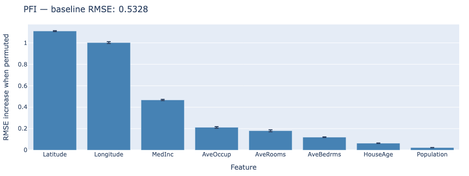
To give a concrete example, consider a regression model predicting house prices based on features like median income (MedInc), latitude, longitude, and other attributes as done in the accompanying notebook, where the performance of the model is measured using Root Mean Squared Error (RMSE). In the picture below, each bar represents the average RMSE increase after permuting that feature across three repeated shuffles; the error bar captures the variance between runs. From the plot, it is easy to see that Latitude and Longitude are the most important features for the model, as their permutation leads to the largest increase in RMSE. In contrast, features like HouseAge and Population (i.e. the block group population), have negligible importance, as their permutation does not significantly affect model performance.
Practical Considerations
Effective application of PFI requires attention to several methodological details. Always use a held-out test set to avoid bias. Evaluating on training data will underestimate the importance of features that prevent overfitting. For stability, repeat the permutation multiple times with different random seeds and average the results, as a single shuffle can yield noisy estimates.
When features are correlated, interpret results carefully. If two features share information, permuting one may not severely impact performance because the other partially compensates. This doesn’t mean the permuted feature is unimportant; rather, importance is distributed across related features. Consider using PFI alongside other interpretability tools like SHAP values or Partial Dependence Plots (PDPs) (Friedman 2001) for a more complete picture.
Strengths and Limitations
PFI offers several compelling advantages. As a model-agnostic method, it works with any predictive algorithm (from linear models to deep neural networks) without requiring access to internal model structures. The approach is intuitive and easy to explain to non-technical stakeholders: shuffling a feature breaks its relationship with the outcome, and performance drops reveal reliance. The method also provides quantitative importance scores that facilitate feature comparison and ranking.
However, limitations exist. Computational cost can be substantial, requiring one complete model evaluation per feature per permutation repetition. Sensitivity to feature correlation can obscure interpretation when features share information. Results may prove unstable on small datasets where random shuffling introduces high variance. Additionally, PFI measures predictive importance but doesn’t reveal the direction of effects or capture complex feature interactions.
5.3.2 Individual Conditional Expectation Plots
While Permutation Feature Importance reveals which features matter globally, Individual Conditional Expectation (ICE) plots show how a specific feature affects predictions for individual instances. This granular view exposes heterogeneity that aggregated methods like Partial Dependence Plots (PDPs) obscure through averaging.
Core Principle
ICE plots visualise how changing one feature’s value affects model predictions for each data point individually. The method answers: How does varying this feature change predictions for different instances, holding all other features constant?
For each instance, we generate a curve showing predictions across a range of feature values. If these curves run parallel, the feature has a consistent effect across all instances. Diverging curves reveal heterogeneity: the feature’s impact varies depending on other characteristics of the data point. This instance-level detail makes ICE plots invaluable for understanding complex, non-linear models where averaged effects mask important variations.
A critical assumption underlying ICE is feature independence. When we vary one feature while holding others fixed, we implicitly assume that the new value is plausible given the fixed features. If features are strongly correlated, some generated instances may fall outside the data distribution, making the corresponding predictions unreliable.
Mathematical Formulation
1. ICE curve definition
For instance \(x^{(i)}\) and a chosen feature \(j\), the ICE curve is the function obtained by varying feature \(j\) across a grid of values \(\cal{G} = \{v_1, ... ,v_g\}\) while fixing all other features at their observed values:
\[\hat{f}^{(i)}_j(v) = \hat{f} \left( v, x_{\setminus j}^{(i)}\right)\]
where \(x_{\setminus j}^{(i)}\) denotes the feature vector of instance \(i\) with feature \(j\) replaced by \(v\) and all other features unchanged.
2. PDP as mean ICE
The Partial Dependence Plot is the pointwise mean of all \(n\) ICE curves:
\[\overline{f_j}(v) = \frac{1}{n} \sum_{i=1}^n \hat{f}_j^{(i)}(v)\] This average marginalises out the effect of all other features, leaving only the average effect of feature \(j\) at value \(v\).
3. Heterogeneity measure
Divergence between ICE curves signals interaction effects. A natural measure of heterogeneity at each grid point is the variance across curves:
\[\mathrm{Var}_j(v) = \frac{1}{n} \sum_{i=1}^n \left( \hat{f}_j^{(i)}(v) - \overline{f_j}(v) \right)^2\]
High variance at a given \(v\) indicates that the effect of feature \(j\) at that value depends strongly on the values of other features. Plotting \(\mathrm{Var}_j(v)\) alongside the ICE curves makes heterogeneity quantitative rather than purely visual.
Implementation Steps
- Select the feature \(j\) to analyse and define a grid \(\cal{G} = \{v_1, ... ,v_g\}\) spanning its observed range.
- For each instance \(x^{(i)}\), generate \(g\) modified inputs by replacing feature \(j\) with each grid value while holding all other features fixed.
- Query the model to obtain predictions \(\hat{f}_j^{(i)}(v)\) for all instance-grid combinations.
- Plot each instance’s curve \(\hat{f}_j^{(i)}(v)\) against \(v\). Overlay the \(\overline{f_j}(v)\) as the PDP mean curve.
- Optionally compute and plot \(\mathrm{Var}_j(v)\) across grid points to quantify heterogeneity.
Interpreting ICE Plots
Visual patterns in ICE plots reveal important characteristics of feature effects. Parallel curves indicate consistent effects; the feature influences all instances similarly. Diverging curves signal heterogeneity, where the feature’s impact depends on other instance characteristics. Flat curves show minimal or no effect for those instances, while sharp changes suggest critical thresholds or decision boundaries.
Worked Example
Consider a medical risk model predicting disease probability for individual patients. Table 2.2 traces predictions for two patients as age is varied from 20 to 60, with all other features held at their observed values.
Both curves rise with age, reflecting a positive age effect. However, Instance 2 sits consistently 0.10 units above Instance 1 at every grid point — a constant vertical offset that the PDP mean curve cannot reveal, because averaging across instances cancels it out. This offset indicates that Instance 2 has other characteristics (for example, elevated comorbidities) that independently push predictions higher regardless of age. The parallel shape of the two curves further confirms that the age effect itself is similar for both patients: it is not age that separates them, but some other feature.
A second pattern is the plateau at age 50–60: predictions rise steeply from 20 to 50 but barely change from 50 onward. This nonlinear saturation is visible in both ICE curves and in the PDP mean, suggesting a genuine threshold in how the model uses age. A PDP alone would show this shape, but only ICE confirms it holds uniformly across instances rather than being an artefact of averaging.
| Age Value | Instance 1 | Instance 2 | PDP (Mean) |
|---|---|---|---|
| 20 | 0.20 | 0.30 | 0.25 |
| 30 | 0.35 | 0.45 | 0.40 |
| 40 | 0.55 | 0.65 | 0.60 |
| 50 | 0.60 | 0.70 | 0.65 |
| 60 | 0.58 | 0.68 | 0.63 |
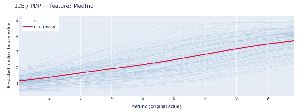
We now consider again the results presented in the companion notebook on the California Housing dataset, where PDP and ICE plots have been used to explain the impact of the MedInc feature. Each faint line is one test instance; the bold line is the PDP mean. The consistent upward slope across all curves confirms a strong, largely uniform effect of income on predicted house values, while the spread between curves reveals that the absolute prediction level varies considerably across instances — reflecting the influence of other features like location.
5.3.3 Practical Considerations
Use representative datasets to ensure meaningful results. For continuous features, include enough grid points to capture relationship shape; for categorical features, evaluate at each category level. As previously stated, be cautious with correlated features, as ICE assumes feature independence when varying one feature while holding others constant.
For large datasets, subsample instances for visualization to avoid cluttered plots that obscure patterns. Combining ICE with PDP provides both individual and average perspectives. While ICE works with any model type, computational cost grows with dataset size and grid resolution. Visual clutter becomes problematic with many instances, and the independence assumption may mislead when features strongly correlate.
5.3.4 Local Interpretable Model-agnostic Explanations (LIME)
While global methods like PFI reveal overall feature importance, many applications require understanding individual predictions. Local Interpretable Model-agnostic Explanations (LIME) addresses this need by explaining specific predictions through locally faithful surrogate models.
Core Principle
LIME answers the question: “If I approximate the model’s behaviour with a simpler linear model in the immediate neighbourhood of this prediction, which features does that local model rely on most?”.
LIME operates on a key insight: complex models may be highly nonlinear globally, but in a sufficiently small region around any single instance, its behaviour can often be approximated well by a much simpler model. LIME exploits this by generating a cloud of perturbed samples around the instance of interest, querying the black-box model for predictions on all of them, and fitting an interpretable surrogate model (typically sparse linear) that mimics the original model’s behavior locally.
The method makes no claim about the complex model’s global behaviour. The surrogate is only required to be faithful in the neighbourhood of the explained instance, which is what makes LIME applicable to any model type regardless of architecture, and what distinguishes it from global interpretability methods. The trade-off is explicit: we sacrifice global fidelity in exchange for a locally faithful, human-readable explanation.
Mathematical Formulation
1. Objective function
For a given instance \(x\), LIME finds an interpretable model \(g\) from a family \(G\) of simple models by solving:
\[\mathrm{arg\ min}_{g \in G} \ \mathcal{L} (f,g,\pi_x) + \Omega(g)\]
where \(f\) is the original black-box model, \(\Omega(g)\) is a complexity penalty that enforces sparsity, \(\pi_x\) is a proximity measure between a perturbed sample and the sample \(x\) , and \(\mathcal{L}\) measures how faithfully \(g\) approximates \(f\) in the local neighbourhood of \(x\).
2. Locality-weighted loss
The loss function is a weighted sum of squared errors over perturbed samples \(z\) drawn around \(x\):
\[\mathcal{L} (f,g,\pi_x) = \sum_{z \in Z} \pi_x(z) \left(f(z)-g(z')\right)^2\]
where \(z\) is a perturbed sample in the original feature space, \(z'\) is its representation in the interpretable feature space, and \(\pi_x(z)\) is a locality weight that downweights samples far from \(x\).
In practice, LIME can be formulated with different loss functions depending on the task (e.g. logistic loss for classification). The squared error, which we used here, is commonly used due to its simplicity and compatibility with linear regression as the surrogate model.
3. Proximity kernel Samples closer to \(x\) receive higher weights via an exponential kernel:
\[\pi_x(z) = \mathrm{exp} \left( - \frac{D(x,z)^2}{\sigma^2} \right)\]
where \(D\) is a distance function appropriate to the data type. This ensures the surrogate focuses on replicating the original model’s behaviour immediately around \(x\) rather than across the full input space.
4. Surrogate coefficients The family \(G\) is typically sparse linear regression. The fitted model takes the form:
\[g(z') = \beta_0 + \sum_{j=1}^p \beta_j z'_j\]
The coefficients \(\beta_j\) are the LIME explanation: positive values indicate features that locally increase the prediction, negative values indicate local suppression, and values near zero indicate negligible local contribution.
This interpretation assumes that the interpretable features \(z'\) are appropriately normalized. Without normalization, coefficient magnitudes are influenced by feature scale and are not directly comparable.
Implementation Steps
The LIME procedure follows six core steps:
- Select the specific input whose prediction requires explanation.
- Generate synthetic samples by randomly perturbing features around the instance. For numerical features, add Gaussian noise; for categorical features, sample alternative categories; for text, mask or remove words.
- Query the original model to obtain predictions for all perturbed samples.
- Compute locality weights based on distance from the original instance, typically using an exponential kernel where closer samples receive higher weights.
- Fit an interpretable surrogate model (usually sparse linear regression) using the weighted perturbed samples and their predictions.
- Interpret the surrogate model’s coefficients as local feature importance scores.
Worked Example
Consider a single patient whose disease risk the model has predicted as high. LIME approximates the model’s local decision surface around this prediction by fitting a sparse linear surrogate to a neighbourhood of the patient’s feature values. Features have been standardized to zero mean and unit variance prior to fitting the surrogate, so the coefficients \(\beta_j\) are on a comparable scale and their magnitudes can be directly compared across features. Table 2.3 shows the resulting surrogate coefficients \(\beta_j\).
Blood pressure is the dominant local driver (\(\beta = +0.18\)): within the neighbourhood of this patient’s input, it pushes the predicted risk upward more than any other feature. Age contributes positively but with roughly two-thirds the influence (\(\beta = +0.12\)). Cholesterol exerts a weak negative effect (\(\beta = -0.05\)), locally suppressing risk slightly — this patient’s cholesterol level is acting as a mild protective factor in this region of the input space. Gender is effectively irrelevant (\(\beta = +0.01\)), contributing less than one-twentieth of blood pressure’s influence. These are strictly local coefficients: they describe the surrogate’s behaviour in the neighbourhood of this specific prediction, not across the full input space.
| Feature | LIME Weight | Interpretation |
|---|---|---|
| Age | +0.12 | Locally increases prediction |
| Cholesterol | −0.05 | Slight local negative influence |
| Blood Pressure | +0.18 | Strong local positive influence |
| Gender | +0.01 | Negligible local contribution |
Practical Considerations
Tuning \(\sigma\) The neighbourhood width parameter \(\sigma\) critically affects results. If \(\sigma\) is too small, explanations become unstable due to insufficient samples; if too large, the local approximation loses fidelity as it incorporates regions where the complex model behaves differently.
Instability LIME’s instability arises because perturbed samples are drawn randomly, so two runs on the same instance can yield different local neighborhoods and different surrogate models. This variance is especially high when the decision boundary is complex or when \(\sigma\) is small. In high-stakes settings, always report explanation variance across runs alongside the explanation itself.
Perturbation strategies by data type Perturbation strategies must match data types. For text, perturb by removing or masking words; for images, use superpixel segmentation to perturb meaningful regions rather than individual pixels. Validate explanation stability by repeating with different perturbation sets.
Locality Remember that explanations are local: they describe the model’s behavior near the explained instance, not globally. Different instances may receive contradictory explanations, which is expected when the model’s decision surface varies across input space.
Strengths and Limitations
LIME offers broad flexibility: it applies to any model type and any data modality, and its linear surrogate coefficients are easy to communicate to non-technical audiences. The local approximation is conceptually transparent and straightforward to implement.
However, LIME has notable weaknesses. Explanations are sensitive to the neighbourhood width \(\sigma\) and the random perturbation seed, and can vary between runs on the same instance (see Practical Considerations above). The local approximation holds only near the explained instance; contradictory explanations across instances are expected when the model’s decision surface is non-uniform.
5.3.5 Randomized Input Sampling for Explanation (RISE)
RISE was introduced primarily for image classification models, where inputs have spatial structure that makes masking a natural perturbation strategy. It extends perturbation-based explanation to produce saliency maps that highlight which input regions drive predictions. While particularly popular for image models, the core principle applies to any input where masking makes sense.
Core Principle
RISE answers the question: “Which regions of the input, when visible to the model, consistently produce high-confidence predictions, and which regions, when masked, cause confidence to drop?”
RISE treats models as black boxes and measures importance through systematic masking. The method repeatedly applies random binary masks to the input, obtains model predictions for each masked version, then aggregates masks weighted by their corresponding predictions. If masking a region causes the model’s confidence to drop, that region must be important; conversely, if masking barely affects the prediction, the region contributes little.
The resulting saliency map estimates importance by computing a weighted average of all masks, where the weight is the model’s output score. Regions consistently present in high-scoring predictions receive high importance values, while regions that appear primarily in low-scoring predictions receive low values.
Mathematical Formulation
1. Random Mask Generation
Let the input have spatial resolution \(H \times W\), where \(H\) and \(W\) denote the height and width, respectively.
Generate \(N\) binary masks \(\{ m_k\}_{k=1}^N\) where each element is drawn independently from a Bernoulli distribution with keep probability \(p\):
\[m_k \sim \mathrm{Bernoulli}(p)^{H\times W}\]
For images, masks are sampled on a coarse grid of size \(h \times w\) and upsampled to input resolution \(H \times W\) for smoother boundaries and better spatial coverage.
2. Masked forward passes
Apply each mask to the input and query the model:
\[s_k = f(x\odot m_k)\]
where \(\odot\) denotes elementwise multiplication and \(f(\cdot)\) returns the target class score. Masked regions are either zeroed or replaced with a baseline value such as the channel mean.
3. Saliency map estimation Aggregate masks weighted by their corresponding scores, normalised by the expected keep probability:
\[S(x) = \frac{1}{p\cdot N} \sum_{k=1}^N s_k \cdot m_k\]
Pixels consistently present in high-scoring masked inputs receive high saliency values. The normalisation by \(p\) corrects for the fact that each pixel is visible in only a fraction of masks on average.
Implementation Steps
RISE follows a systematic six-step procedure:
- Choose the target output to explain, a specific class probability for classification or the regression value for regression tasks.
- Generate random binary masks. For images, sample Bernoulli values on a coarse grid and upsample to image resolution with optional random shifts for better coverage. The keep probability \(p\) controls how much of the input remains visible in each mask.
- Create masked inputs by applying each mask to the original input \(x\) via \(x \odot m_k\), either zeroing masked regions or replacing them with baseline values.
- Query the model for predictions \(s_k = f(x\odot m_k)\) on all masked inputs.
- Compute the saliency map by aggregating masks weighted by their scores, normalized by the expected keep probability: \(S(x) = \frac{1}{p \cdot N} \sum_{k=1}^N s_k \cdot m_k\)
- Visualize results by overlaying the saliency heatmap on the original input, with high values indicating regions supporting the prediction.
Design Choices and Best Practices
Several design decisions significantly impact RISE quality. Use enough masks, typically thousands, for stable heatmaps; too few produce noisy, speckled results. Choose the keep probability p thoughtfully: too high barely changes the input, providing weak signal; too low makes inputs unrecognizable, yielding noisy estimates. Values between 0.3 and 0.7 often work well.
Generate masks on coarse grids and upsample for computational efficiency and smoother maps. Prefer model score outputs over hard labels to avoid discontinuities; gradual confidence changes provide more stable signals than binary class switches. For correlated regions like textures, consider structured masks based on superpixels rather than random grids. Validate stability by repeating with different random seeds.
Strengths and Limitations
RISE offers full model-agnosticism and produces intuitive visualizations. The masking approach is straightforward to explain with minimal implementation complexity. However, computational cost can be substantial, requiring thousands of forward passes. Results depend heavily on masking design choices, and saliency maps may be noisy without sufficient masks. Additionally, RISE may highlight correlated but non-causal regions, particularly when models exploit spurious correlations in training data.
5.3.6 SHapley Additive exPlanations (SHAP)
While methods like LIME and RISE provide valuable local explanations, SHAP offers a unified framework grounded in game theory that provides both theoretical guarantees and practical effectiveness. SHAP attributes predictions to features by fairly distributing credit across all possible feature combinations.
Core Principle
SHAP builds on Shapley values from cooperative game theory, which provide a principled way to distribute payoffs among players who contribute differently to outcomes. In the machine learning context, features are players, and the payoff is the model’s prediction. The Shapley value for a feature represents its average contribution across all possible coalitions of features.
This approach answers: How much did each feature contribute to this prediction compared to a baseline? The method evaluates how including a feature changes predictions across all possible subsets of other features, weighting each marginal contribution by the probability that the corresponding coalition forms under a uniform random ordering of features.
Axiomatic Properties
SHAP values uniquely satisfy four fundamental axioms, inherited from Shapley’s framework in cooperative game theory (Shapley 1952), which ensure fair and consistent attribution:
- Efficiency: Feature attributions sum exactly to the difference between the prediction and expected baseline. This ensures complete accounting: all prediction components are attributed to some feature.
- Symmetry: Features that contribute identically across all contexts receive identical attributions. This prevents arbitrary distinctions between functionally equivalent features.
- Additivity: For ensemble or composite models, attributions from individual components combine linearly. This enables decomposition of complex model explanations into simpler parts.
- Dummy: If a feature has no impact on predictions regardless of which coalition it joins, its attribution is exactly zero.
These axioms distinguish SHAP from heuristic methods, providing mathematical guarantees about explanation consistency and fairness.
Mathematical Framework
1. Shapley value definition
The Shapley value for feature \(j\) is:
\[\phi_j(f) = \sum_{S \subseteq F\smallsetminus\{j\}} \frac{|S|!(|F| - |S| - 1)!}{|F|!} [f(S\cup\{j\}) - f(S)]\]
where \(F\) is the full feature set, \(S\) ranges over all subsets not containing \(j\), and \(f(S)\) denotes the model’s expected output when only the features in S are known. The combinatorial weight \(\frac{|S|!(|F| - |S| - 1)!}{|F|!}\) ensures every possible ordering of features is considered equally, giving each feature fair marginal credit.
2. SHAP as additive feature attribution
SHAP expresses each prediction as a sum of feature contributions around a baseline:
\[f(x) = \phi_0 + \sum_{j=1}^{|F|} \phi_j\]
where \(\phi_0 = \mathbb{E}[f(x)]\) is the baseline, the expected model output over the background dataset, and each \(\phi_j\) is the Shapley value for feature \(j\). This additive decomposition is what makes SHAP explanations directly interpretable: each feature is assigned a single number that represents its contribution to the deviation of the prediction from the baseline.
3. Background data and marginalisation
The expected output \(f(S)\) for a coalition \(S\) is computed by marginalising over the background dataset for the unobserved features:
\[f(S) = \mathbb{E}_{x_{\bar{S}} \sim \mathcal{D}}\left[f(x_S,\ x_{\bar{S}})\right]\]
A common choice for \(\mathcal{D}\) is a random sample of the training data, which approximates the marginal feature distribution. Using a single reference point such as a zero vector can produce attributions that reflect deviation from an arbitrary baseline rather than from typical model behaviour, skewing all attributions in a direction determined by that choice rather than by the data.
Implementation Steps
Computing SHAP values in practice follows a six-step process:
- Choose a background dataset representative of the input distribution. This defines \(\phi_0 = \mathbb{E}[f(x)]\) and determines the baseline against which all feature contributions are measured.
- Select the instance x to explain.
- Choose the appropriate SHAP variant: TreeSHAP provides exact Shapley values for tree-based models in polynomial time by exploiting tree structure. KernelSHAP approximates values through weighted linear regression with kernel weights specifically chosen to satisfy the Shapley axioms. DeepSHAP extends these ideas to neural networks using backpropagation-based approximations.
- Compute SHAP values \(\phi_j\) for each feature, either exactly via TreeSHAP or through weighted sampling approximation via KernelSHAP.
- Verify the efficiency property: confirm that \(\sum_j \phi_j \approx f(x) - \mathbb{E}[f(x)]\). A large discrepancy indicates a problem with the background dataset or approximation.
- Visualise using waterfall plots for individual predictions, beeswarm or summary plots for global patterns, and dependence plots for feature-level relationships.
Worked Example
The same four features from the LIME example are examined here for the same risk prediction task, now using SHAP. Table 2.4 shows the Shapley values \(\phi_j\) for each feature.
The efficiency axiom guarantees that the attributions sum exactly to the deviation from the expected prediction: \(\sum_j \phi_j = 0.15 + (-0.08) + 0.20 + 0.00 = +0.27\), meaning this patient’s predicted risk is 0.27 units above the population baseline \(\phi_0 = \mathbb{E}[f(x)]\). Every unit of that deviation is fully accounted for.
Blood pressure again emerges as the strongest driver (\(\phi = +0.20\)), followed by age (\(\phi = +0.15\)). Cholesterol carries a negative value (\(\phi = -0.08\)), indicating a protective effect: this patient’s cholesterol level is working against the high-risk prediction. Gender receives exactly zero attribution, satisfying the Dummy axiom — it has no marginal contribution across any coalition of features. The agreement between LIME and SHAP on the ranking and direction of all four features provides cross-method validation; unlike LIME’s locally fitted surrogate, however, SHAP’s values satisfy Efficiency, Symmetry, Additivity, and Dummy by construction.
| Feature | SHAP Value | Interpretation |
|---|---|---|
| Age | +0.15 | Increases predicted risk by 0.15 |
| Cholesterol | −0.08 | Decreases predicted risk by 0.08 |
| Blood Pressure | +0.20 | Strongly increases predicted risk |
| Gender | 0.00 | No measurable effect |
We then show part of the results from the companion notebook on the California Housing dataset, as done in the previous sections using LIME and SHAP. The figure below shows a side-by-side comparison of LIME and SHAP attributions for a single California Housing test instance. Both methods identify Longitude and AveOccup as the dominant features with large negative contributions. However, they disagree on the sign of MedInc: LIME assigns it a positive coefficient while SHAP assigns it a negative Shapley value. Both methods use the same sign convention — positive means the feature pushes the prediction up, negative means it pushes it down — but they answer different questions. LIME fits a local linear surrogate in the neighbourhood of the instance and asks how varying MedInc affects the prediction locally; in that neighbourhood, higher income is associated with higher house values, hence a positive coefficient. SHAP instead measures MedInc’s average marginal contribution relative to the background mean \(\mathbb{E}[f(X)]\): for this below-average house, the instance’s MedInc is lower than the dataset average, where \(\mathbb{E}[f(X)] = 2.008\), so it pulls the prediction below the baseline and receives a negative Shapley value. The apparent sign disagreement therefore reflects a difference in reference point — local neighbourhood vs global baseline — not a difference in sign convention. 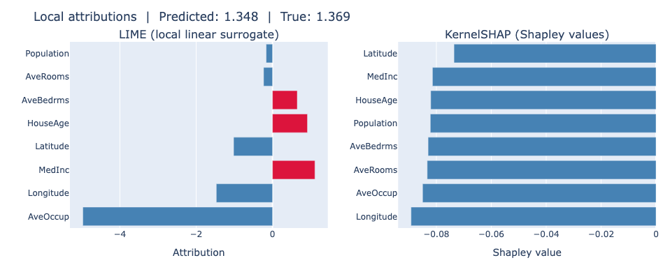
5.3.7 Practical Application Guidelines
Use TreeSHAP for tree-based models when exact values and computational efficiency matter. Apply KernelSHAP or DeepSHAP for black-box or neural models where approximation is necessary. Select background data that reflects typical input distribution; this defines the baseline against which contributions are measured. Poor baseline choices can skew attributions significantly.
Visualize results using summary plots for global patterns, dependence plots for feature relationships, and waterfall plots for individual predictions. When features strongly correlate, SHAP may distribute attribution among correlated features in ways that seem arbitrary. Use SHAP interaction values to diagnose and understand these cases. Validate attributions against domain expertise and sensitivity analyses to ensure explanations align with substantive knowledge.
Strengths and Limitations
SHAP provides rigorous theoretical foundations, model-agnostic applicability, and both local and global explanation capabilities. The efficiency axiom ensures complete accounting, while additivity enables ensemble model decomposition. However, exact computation remains exponentially expensive beyond approximately 20 features, necessitating approximation methods. Background dataset choice affects results, and strong feature correlation can complicate attribution interpretation despite the method’s mathematical rigor.
5.3.8 Conclusion
Perturbation and feature attribution methods provide complementary lenses for understanding model behaviour. Permutation Feature Importance offers global importance rankings through systematic feature shuffling. ICE plots reveal instance-level heterogeneity in feature effects. LIME and RISE explain individual predictions through local approximation and masking, respectively. SHAP unifies these approaches under game-theoretic principles with mathematical guarantees.
No single method suffices for all contexts. Global methods like PFI miss instance-specific nuances. Local methods like LIME sacrifice consistency for interpretability. SHAP balances rigor with computational demands. Effective model interpretation combines multiple methods, triangulating insights to build robust understanding of how features drive predictions across different scales and contexts.
The choice of method depends on specific needs: computational budget, required explanation scope (global versus local), model type, and stakeholder sophistication. Understanding each method’s strengths, limitations, and appropriate use cases enables practitioners to select and combine techniques effectively, building trust and transparency in machine learning systems.
5.4 Example-Based and Data-Centric Explanation Methods
Gradient-based and perturbation-based methods (Chapters 1 and 2) explain a model’s prediction by attributing importance scores to individual input features. Example-based methods take a different approach by explaining a prediction using the training data — either by identifying representative examples that summarize what the model has learned, or by tracing which training points were most influential in shaping a specific prediction.
These methods are particularly useful when a practitioner wants to audit their training data for mislabeled or harmful examples, and to understand why a model generalizes well (or fails) on a specific type of input. Using example-based explanations can also help meet regulatory requirements that demand decisions be justified by precedent (e.g., in medical or legal contexts).
This chapter covers two families of example-based methods that answer two different but related questions:
- Prototypes and Protopatches — which examples or regions of examples best summarize the dataset or a model’s internal representations?
- Influence Functions — which training examples most affected a given prediction?
5.4.1 Prototypes and Protopatches
What is a Prototype?
A prototype is a real training example selected to be representative of a class or a cluster. Unlike a class centroid (which may not correspond to any real data point), a prototype is always a genuine sample from the dataset. The goal is to summarize the training data with a small, human-interpretable set of examples.
A complementary concept is the criticism (or counter-example): a training point that is not well represented by the selected prototypes. Criticisms highlight edge cases and outliers, giving a more complete picture of the data distribution.
A protopatch is a localized variant: instead of selecting a full example, it identifies the most discriminative region (patch) of an example. This is especially relevant for image data, where a prototype image might contain irrelevant background, and only a specific region (e.g., the beak of a bird) actually drives the model’s decision.
MMD-Critic
MMD-Critic (Kim et al. 2016) is a model-agnostic method that selects prototypes and criticisms from a dataset using Maximum Mean Discrepancy (MMD), a statistical measure of how different two distributions are.
The goal of the method is to find the smallest set of prototypes \(\mathcal{P} \subseteq \mathcal{X}\) such that the distribution of prototypes is as close as possible to the distribution of the full dataset \(\mathcal{X}\).
Mathematical formulation
The MMD between the prototype set and the full dataset is:
\[\text{MMD}^2(\mathcal{P}, \mathcal{X}) = \frac{1}{|\mathcal{P}|^2}\sum_{p,p' \in \mathcal{P}} k(p,p') - \frac{2}{|\mathcal{P}||\mathcal{X}|}\sum_{p \in \mathcal{P}, x \in \mathcal{X}} k(p,x) + \frac{1}{|\mathcal{X}|^2}\sum_{x,x' \in \mathcal{X}} k(x,x')\]
where \(k(\cdot, \cdot)\) is a kernel function (typically RBF/Gaussian). Minimizing this quantity means the prototypes cover the data distribution as faithfully as possible.
Once prototypes are selected, criticisms are identified using a witness function \(w(x)\) as points that are poorly represented by the prototype set, which can be defined as:
\[w(x) = \frac{1}{|\mathcal{X}|}\sum_{x' \in \mathcal{X}} k(x',x) - \frac{1}{|\mathcal{P}|}\sum_{p \in \mathcal{P}} k(p,x)\]
The witness function measures the maximum discrepancy between the data distribution and the prototype distribution at point \(x\). Points with high \(w(x)\) are not well represented by the prototypes and are thus selected as criticisms. Criticisms are points with high absolute value in the witness function and they are also usually selected with a greedy procedure.
In practice:
- Choose the number of prototypes \(m\).
- Run a greedy search to select the \(m\) training examples that minimize MMD.
- Identify criticisms as training points with the highest witness function values.
An example implementation of MMD-Critic on the MNIST dataset is available in the accompanying Jupyter notebook Chapter3_Example_Based.ipynb and the results are shown in the figure below.

As can be seen, the prototypes (top row) are typical examples of each digit class, while the criticisms (bottom row) are atypical or ambiguous samples that are not well represented by the prototypes, such as the 8 bending towards the right that is different from stereotypical 8s.
A projection in 2D of the data distribution and the prototypes is shown in the figure below, where the prototypes are highlighted as blue stars and criticisms as red crosses.

Most prototypes (blue stars) are spread across dense regions of the data distribution, while most criticisms (red crosses) cluster near the margins or at class boundaries. Note that a few criticisms appear close to prototypes in this projection: this is not a contradiction. A criticism near a prototype often sits right at a class boundary — the prototype anchors the dense, unambiguous core of a class, while the adjacent criticism falls in an overlap region between two classes, making it atypical and poorly represented despite its geometric proximity. Additionally, the t-SNE projections might have distorted distances.
This gives a balanced view of the data distribution, highlighting both what the model has learned and where it struggles.
As a side note, the more recently proposed ProtoDash (Gurumoorthy et al. 2019) method generalizes MMD-Critic in two ways. First, it assigns a non-negative importance weight to each prototype, with each of them being indicative of the importance of each prototype. Second, a faster optimization procedure is proposed, thereby reducing computational cost. The method is natively implemented into the Python library AIX360.
Strengths and Limitations
The explanation method is model-agnostic and thus works on raw data without access to model internals, and this makes it widely applicable. In addition, it produces both representative and atypical examples, giving a balanced view between what the model has seen the most during the training process and what it has seen the least.
However, there are some limitations to keep in mind. Prototypes summarize the data distribution, not the model’s decision boundary, and thus a prototype may not be an example for which the model is most confident. Furthermore, it requires choosing non-trivial values for the kernel and the number of prototypes and having access to the training data, which may not always be possible.
ProtoPNet
ProtoPNet (C. Chen et al. 2019) is a model-intrinsic method: the network is explicitly designed so that its reasoning is prototype-based and interpretable by construction.
The core idea is that the network learns a set of prototypical parts — small patches extracted from training images — during training and how to compare them with patches of the input image. At inference time, the model compares patches of the input image to these learned prototypes and bases its classification on the similarity scores.
The classification of a new image \(x\) follows three steps, illustrated in the figure below:
- Feature extraction: compute a convolutional feature map \(f(x)\).
- Prototype similarity: for each learned prototype \(p_j\), the Euclidean distance between \(p_j\) and each patch of \(f(x)\) is computed, and the minimum distance is converted into a similarity score \(g_j(x)\).
- Prediction: a fully-connected layer combines the similarity scores \(g_j(x)\) into a final class prediction.

Figure: ProtoPNet inference pipeline. The input image is passed through a CNN to produce a feature map. Each learned prototype \(p_j\) (associated with a class) is compared to all patches of the feature map via minimum Euclidean distance, converted into a similarity score \(g_j(x)\). A fully connected layer combines these scores into the final class prediction.
This produces explanations of the form:
“This image looks like [prototype patch from training image A] in this region, and like [prototype patch from training image B] in that region — therefore it is classified as class C.”
Strengths and Limitations
In ProtoPNet, explanations are faithful by design: the prototype similarity scores are the computation, not a post-hoc approximation. This makes them highly interpretable for visual domains: you can inspect which training patches drive each decision.
However, there are some limitations to consider. First, it requires a strict architecture that does not allow for arbitrary backbones or training procedures, and it needs to be trained from scratch. This makes it less flexible and more expensive to deploy on top of existing models. Moreover, the number of prototypes is a hyperparameter that needs to be tuned, and the quality of the prototypes depends heavily on the diversity of the training set.
Finally, industrial and clinical adoption of ProtoPNet remains limited. The method has been explored in medical imaging — notably histopathology and breast cancer classification — as a way to produce decisions that pathologists can inspect and validate (Pathak et al. 2024).
More information on the method and its development can be found in the website of the original project: https://prototypeneuralnetworks.cs.duke.edu/interpnn2023/docs/
5.4.2 Influence Functions
An influence function measures how much a single training example affects the model’s predictions. Concretely, it estimates: if we removed (or slightly up-weighted) training point \(z_i\), how would the model’s prediction on a test point \(z_\text{test}\) change?
This makes the Influence Functions a powerful tool for:
- Debugging: identifying mislabeled or corrupted training points that degrade performance.
- Data valuation: assigning a score to each training example based on its contribution.
- Security: detecting data poisoning attacks.
- Fairness auditing: tracing biased predictions back to biased training data.
Influence Functions Applied to Modern Machine Learning
Koh and Liang (Koh and Liang 2017) adapted the classical influence function from robust statistics to modern machine learning. The key insight is that instead of retraining the model without \(z_i\) (which is expensive), we can approximate the effect on the parameter change if \(z_i\) were upweighted by some small weight using the Hessian of the training loss.
The influence of training point \(z\) on the model’s prediction for test point \(z_\text{test}\) is:
\[\mathcal{I}(z,\, z_\text{test}) = -\nabla_\theta L(z_\text{test},\, \hat{\theta})^\top \, H_{\hat{\theta}}^{-1} \, \nabla_\theta L(z,\, \hat{\theta})\]
where: - \(L(\cdot, \hat{\theta})\) is the loss function evaluated at the trained parameters \(\hat{\theta}\) - \(H_{\hat{\theta}}\) is the Hessian of the training loss, - \(\nabla_\theta L(z, \hat{\theta})\) is the gradient of the loss for training point \(z\).
Intuitively, the term \(\nabla_\theta L(z, \hat{\theta})\) captures how the training example \(z\) pushes the model parameters during training, while the Hessian inverse \(H_{\hat{\theta}}^{-1}\) corrects for the curvature of the loss landscape. The dot product with \(\nabla_\theta L(z_\text{test}, \hat{\theta})\) measures how that push aligns with what would improve (or hurt) the test prediction.
A positive influence score means the training point helps the test prediction; a negative score means it hurts it.
Strengths and Limitations
The main advantage of this approach is that no retraining is required: influence is estimated analytically from a single trained model, and the resulting score is signed and directly interpretable. The method applies to any differentiable model.
The main limitation is computational: computing the inverse Hessian (or even a good approximation via LiSSA) is expensive for large models. More fundamentally, the second-order Taylor approximation underlying the method assumes the loss surface is well-behaved near the optimum; in practice, large neural networks have highly non-convex loss landscapes and the approximation can be unreliable. The method should therefore be treated as a heuristic rather than an exact measure when applied to deep networks.
Adoption of Influence Functions
The computational cost of the original Koh and Liang formulation made it impractical for large networks, and much of the subsequent work has focused on making influence estimation scalable. TracIn (Pruthi et al. 2020) is the most widely adopted solution: instead of reasoning about the loss curvature at a single final checkpoint, it traces gradient descent and measures how much a training example reduces the test loss each time it is visited during training.
In practice, the sum is approximated by evaluating it only at a small number of saved checkpoints during training. The intuition is straightforward: if the gradients of \(z\) and \(z_\text{test}\) point in the same direction at step \(t\), then training on \(z\) at that step reduced the loss on \(z_\text{test}\) — meaning \(z\) was helpful. Negative dot products indicate harmful influence. TracIn avoids the Hessian entirely, reducing to gradient dot products that are cheap to compute even for large models, and it does not assume the model is at a convex optimum. The main cost is storage overhead from saving checkpoints at regular intervals.
Despite the scalability challenges, influence functions have found adoption beyond academic benchmarks. Grosse et al. (Grosse et al. 2023) applied an Eigenvalue-corrected Kronecker-Factored Approximate Curvature (EK-FAC) to study generalization in Large Language Models (LLMs) with up to 52 billion parameters, demonstrating that influence scores can identify which pretraining sequences most affect a given prediction — an application with direct relevance for model auditing, data curation, and understanding memorization in LLMs.
5.4.3 Practical Recommendations on Example-Based Explanations
To summarize, example-based explanations are a powerful tool for understanding and auditing machine learning models, but they come with trade-offs in terms of computational cost and interpretability.
- Use MMD-Critic when you want to summarize or audit your dataset without touching your model.
- Use ProtoPNet when you are designing a new classifier and interpretability is a first-class requirement.
- Use Influence Functions (Koh & Liang) when your model is relatively small and you need a theoretically grounded importance score per training example.
In all cases, influence-based explanations should be validated qualitatively: inspect the most influential examples and verify they align with domain knowledge before drawing conclusions.
5.5 Practical Use Cases Across Modalities
The preceding chapters introduced gradient-based, perturbation-based, and example-based methods as isolated methodological families. In practice, XAI methods are never selected or evaluated in a vacuum: they must be calibrated against the concrete requirements of a deployment context — input modality, latency budget, regulatory constraints, and the interpretability needs of the end user.
This chapter grounds those theoretical foundations in two real-world scenarios spanning different modalities and explanation types.
Use Case 1 — Vision: Lung Cancer Detection from CT Scans applies spatial attribution methods (Grad-CAM, Grad-CAM++, Integrated Gradients, and Occlusion) to a CNN-based medical imaging pipeline. Rather than focusing on model development, the use case adopts a production-oriented perspective: it evaluates explanation quality on clinically relevant regions, computational overhead under resource constraints, and robustness of attributions to input perturbations.
Use Case 2 — NLP: Positional Bias in Financial Decision-Making applies SHAP token attribution to an instruction-tuned LLM queried on financial comparison tasks. The use case demonstrates that perturbation-based attribution methods transfer directly from tabular and vision settings to language models, and shows how signed token-level attributions can surface a systematic failure mode, i.e. positional bias, that coarser performance metrics would miss entirely.
Together, the two use cases illustrate a recurring practical pattern: no single explanation method is universally optimal. Method selection must be driven by the architecture, the modality, and the deployment constraints of the target system, a theme that runs throughout this guide.
5.5.1 Use Case 1: Vision - Lung Cancer Detection from CT Scans
This use case showcases a production-style pipeline for lung nodule detection from CT scans, built around a 3D ResNet-18 (MONAI (Cardoso et al. 2022) implementation) fine-tuned on the LIDC-IDRI dataset (Armato III et al. 2011). The system emphasises inference performance, explainability quality, and computational cost under realistic deployment constraints.
Lung cancer remains one of the leading causes of cancer-related death worldwide. Early detection from CT imaging can significantly improve patient outcomes, but radiological interpretation is time-consuming and subject to inter-observer variability. Rather than focusing on model development, this use case explores how a deep learning system behaves under realistic deployment conditions, with a focus on:
- inference performance under resource constraints,
- explainability quality and reliability,
- computational cost of interpretation methods,
- stability of explanations under clinical-like inputs.
LIDC-IDRI Dataset
This use case is built on the LIDC-IDRI dataset (Armato III et al. 2011): over 1 000 CT scans annotated by up to 4 radiologists with nodule contours and per-nodule malignancy scores (1–5 scale). The task is treated as a binary detection problem, i.e., nodule vs. background. In our example run, only candidate regions with agreement from at least 2 radiologists are retained as positive samples, controlling for inter-reader variability.
System Overview
The model is a 3D ResNet-18 for which we suggest using Med3D (S. Chen et al. 2019) pretrained weights (Tencent MedicalNet), fine-tuned on \(64^3\) voxel patches (small 64 × 64 × 64 cubic sub-volumes cropped around each nodule candidate) extracted from LIDC-IDRI CT volumes. Each patch is provided as a single-channel volume whose intensity values are expressed in Hounsfield Units (HU), the radiodensity scale of CT scanners that ranges from −1 000 for air to +1 000 and above for bone; these are normalised to [-1, 1] before being fed to the network. The output is a 2-class softmax score over the background and nodule classes.
The pipeline is organised as five sequential scripts:
0_DownloadData.py— downloads DICOM files from TCIA or Kaggle using a manifest file1_ProcessData.py— resamples volumes to isotropic 1 mm spacing, extracts \(64^3\) patches, applies HU windowing, and creates patient-level train/val/test splits2_FinetuneResnet3D.py— two-phase fine-tuning (head-only warmup, then upper-layer unfreezing) using AdamW, cosine annealing, and label smoothing; targets validation AUC as the checkpoint metric; expected test AUC: 0.88–0.943_InferAndEvaluate.py— single entry point for both prediction and XAI benchmarking; supports CPU/single-GPU/multi-GPU DataParallel, batch or single-sample mode4_VisualiseResults.py— generates saliency overlays in patch mode (\(64^3\) view) or context mode (full CT slice with the heatmap placed at the nodule’s anatomical location)
All scripts are also available directly on the GitHub repository.
In our experiments, training and inference were launched via Slurm (launch.sbatch / infer.sbatch) on multi-GPU HPC nodes equipped with AMD MI250X GPUs, as the one available at CINES.
Explainability Methods
Four methods are implemented, covering gradient-based, attribution-based, and perturbation-based families:
| Method | Type | Latency | Spatial fidelity |
|---|---|---|---|
| Grad-CAM | Gradient-based | Low | Medium |
| Grad-CAM++ | Gradient-based | Low | Medium-High |
| Integrated Gradients | Attribution | Medium | High |
| Occlusion | Perturbation-based | High | High |
All methods produce a 3D saliency volume of shape (D, H, W) saved as .npy alongside the inference output. Grad-CAM and Grad-CAM++ attach to the final convolutional block; Integrated Gradients uses a zero-baseline with a configurable number of interpolation steps; Occlusion slides a configurable 3D window over the patch and measures the drop in nodule probability.
Production-Oriented Perspective
This implementation explicitly considers deployment constraints inspired by hospital environments, including: - Limited GPU availability - Strict inference latency requirements - Batch vs real-time inference trade-offs - Selective explainability (explanations generated only when needed)
This allows the system to be evaluated not only as a machine learning model, but as a deployable diagnostic support component.
Evaluation Focus
When --xai all --report is passed to 3_InferAndEvaluate.py, each method is benchmarked along two quantitative axes:
Computational Cost
Per-sample latency (ms) and peak GPU memory (MB) are recorded for every method, enabling direct cost comparisons across the gradient-based, attribution-based, and perturbation-based families under identical hardware conditions.
Stability
Mean cosine similarity between the base saliency map and saliency maps computed on Gaussian-noise-perturbed inputs, averaged over 5 trials (score in [-1, 1]; higher is more stable). Concretely, for each trial a small noise term — sampled from \(\mathcal{N}(0, 0.02^2)\) in the normalised [-1, 1] input space — is added to the patch, the XAI method is re-run, and the cosine similarity between the two flattened saliency volumes is recorded. A score close to 1 indicates that the explanation is robust to small input variations — a critical property for clinical deployment where slight acquisition differences between scans must not alter the explanation substantially.
The table below reports the results from the example run on 192 test patches (1 AMD MI250X GPU):
| Method | Latency (ms/sample) | GPU Memory (MB) | Stability |
|---|---|---|---|
| Grad-CAM | 85.1 | 899.6 | 1.000 |
| Grad-CAM++ | 34.6 | 899.6 | 1.000 |
| Integrated Gradients | 1 130.4 | 13 914.6 | 0.759 |
| Occlusion | 1 583.5 | 576.8 | 0.050 |
Grad-CAM++ is the fastest method overall, while Occlusion is the slowest by a wide margin due to its exhaustive sliding-window passes. Gradient-based methods achieve perfect stability scores, meaning their saliency maps are entirely unaffected by small input perturbations. Integrated Gradients retains moderate stability (0.759), while Occlusion is highly sensitive to input noise (0.050), reflecting the stochastic nature of patch-level score differences under perturbation.
Example Output
The figures below show the XAI comparison in context mode for two nodule-positive patches from the test set. Each figure is a 5 × 3 grid: rows correspond to the CT input and to each of the four saliency methods (Grad-CAM++, Grad-CAM, Integrated Gradients, Occlusion); columns show the axial, coronal, and sagittal cross-sections through the nodule centre. The dashed bounding box in the top row marks the \(64^3\) patch region; the colour scale (blue → red) encodes normalised saliency in [0, 1].
LIDC-IDRI-0017 (axial slice 93 — small nodule, right lung):
LIDC-IDRI-0050 (axial slice 111 — larger nodule, right upper lobe):
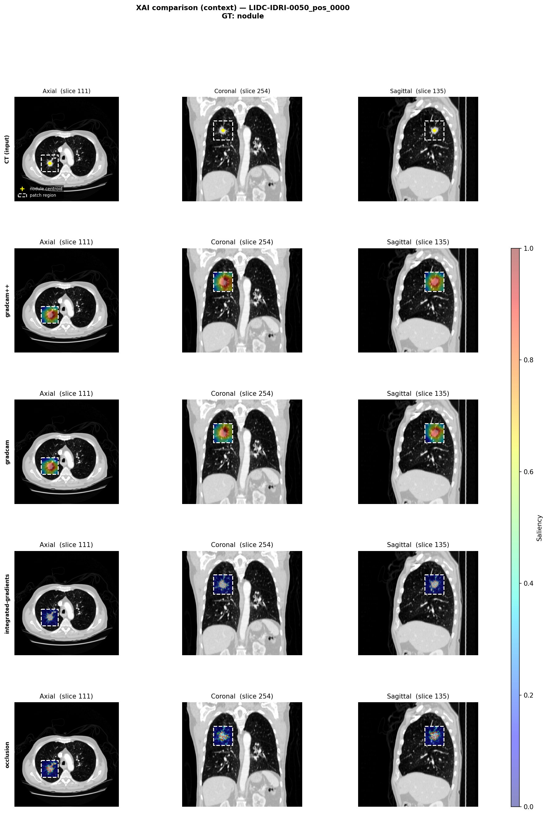
Both examples illustrate the trade-off between spatial precision and computational cost: gradient-based methods (Grad-CAM, Grad-CAM++) localise the nodule quickly but at coarser resolution, while Integrated Gradients and Occlusion produce tighter, voxel-level attributions at the expense of higher latency.
5.5.2 Use Case 2: NLP — Tracing Positional Bias in Financial Decision-Making
Large language models (LLMs) are increasingly used as decision-support tools in finance: portfolio managers may query them for comparative asset assessments, risk analysts may rely on them for scenario summaries, and automated advisory systems may use them to recommend between investment options. In all these settings, a critical but often overlooked failure mode is positional bias — the systematic tendency of a model to prefer options based on their order of presentation, rather than on the merits of the financial information provided.
This use case is based on the work of Dimino et al. (Dimino et al. 2025), which presents the first unified framework to detect, quantify, and mechanistically explain positional bias in binary financial decision-making using instruction-tuned LLMs. The study demonstrates that such bias is pervasive across financial reasoning categories, sensitive to model scale and prompt design, and traceable to specific internal components of the transformer architecture. For the sake of applying the same XAI methods introduced in the previous chapters, in this case we adapt a methodology similar to the one used in the aforementioned paper, but we mainly focus on the SHAP analysis of prompts suffering from positional bias, without going into the mechanistic analysis of the model’s internal components.
Problem Statement
Given a prompt that asks an LLM to compare two financial assets (e.g., “Between Company A and Company B, which has stronger fundamentals?”), the model should respond based on the semantic content of the financial descriptions. Instead, models frequently exhibit preference for one option simply because it appears first or second in the prompt. This phenomenon is known as primacy or recency bias.
In financial settings, such biases carry direct consequences. Systematically preferring the first-mentioned asset distorts risk assessments and portfolio allocation recommendations regardless of the underlying financial data. Because the bias originates inside the model, it will not be eliminated by changing the input data alone — it must be detected and quantified through targeted analysis of the model’s input–output behaviour.
Dataset
A simplified dataset is constructed using four large-cap U.S. tech companies (MSFT, NVDA, GOOGL, TSLA), yielding six unique unordered pairs. Each pair is evaluated across four financial categories and four advisor framings, and queried under both possible orderings (A before B and B before A). The resulting dataset structure is summarised in the table below.
| Parameter | Value |
|---|---|
| Companies | 4 (MSFT, NVDA, GOOGL, TSLA) |
| Pair configurations | 12 ordered company pairs (6 unordered pairs × 2 orderings) |
| Financial categories | 4 types: Fundamental, Sentiment, ESG, Technical |
| System prompt styles | 4 advisor framings: Conservative, Moderate, Aggressive, Default |
| Configurations per pair | 16 (4 categories × 4 styles) |
| Total forward passes | 192 (12 ordered pairs × 16 configurations) |
Table 4.1: Structure of the finance benchmark used to evaluate positional bias across financial reasoning categories and advisor framings.
Crucially, each pair is evaluated under both possible orderings (A before B and B before A). A bias-free model should not change its preference when the companies are swapped. Divergence between the two orderings provides a direct measure of positional bias rather than preference for a given company’s fundamentals.
The prompt template is of the form:
“Between
{company_a}and{company_b}, which is the better investment based on{category}? Answer with only the ticker.”
The system prompt is varied across four styles to test the influence of framing on bias magnitude and is in the form:
“You are a {style} investment advisor. When presented with two company ticker symbols, you must select exactly one based on specified criteria.”
where {company_a}, {company_b}, {category}, and {style} are derived from the dataset.
Analysed Model
Following what has been presented in (Dimino et al. 2025), a model of Qwen 2.5 family is used, but only the 1.5B version to maximise the number of prompt configurations that can be evaluated while keeping the computational cost manageable. The notebook can be easily adapted to run the same analysis on other models and scales, but the focus here is on demonstrating the SHAP analysis of positional bias rather than on model performance.
Analysis Approach
A bias-free model would respond identically regardless of whether Company A appears first or second in the prompt. The notebook tests this directly using greedy decoding and then applies SHAP to explain the cases where it fails.
Step 1 — Identifying Discordant Pairs
For each combination of company pair, financial category, and system prompt style, the model is queried under both orderings using:
- A-first: “Between A and B, which is the better investment based on category?”
- B-first: “Between B and A, which is the better investment based on category?”
A combination is discordant when the predicted ticker differs between the two orderings — exactly the instances where positional bias has caused a flip in the model’s decision. We then identify all discordant pairs across the dataset, which become the focus of the subsequent SHAP analysis to trace the token-level drivers of the bias.
Step 2 — SHAP Token Attribution on Discordant Pairs
SHAP attributes the model’s prediction to individual input features by computing each feature’s average marginal contribution across all possible coalitions. Here the features are the tokens of the user message and the prediction score is the log-odds:
\[\text{log-odds} = z_A - z_B\]
where \(z_A\) and \(z_B\) are the raw model logits for the two competing tickers at the generation position. Using log-odds rather than a softmax probability gives a natural baseline of 0 (no preference between the two tickers), so SHAP attributions from both orderings are directly comparable.
With this setup, a positive SHAP value for a token means it pushed the log-odds towards A; a negative value pushed it towards B. Comparing the two orderings directly reveals which tokens are responsible for the position-dependent flip.
Results
As an example, the figure below shows the SHAP attribution maps for a discordant pair under both orderings. The first ordering (A listed first) predicts A, while the second ordering (B listed first) predicts B.
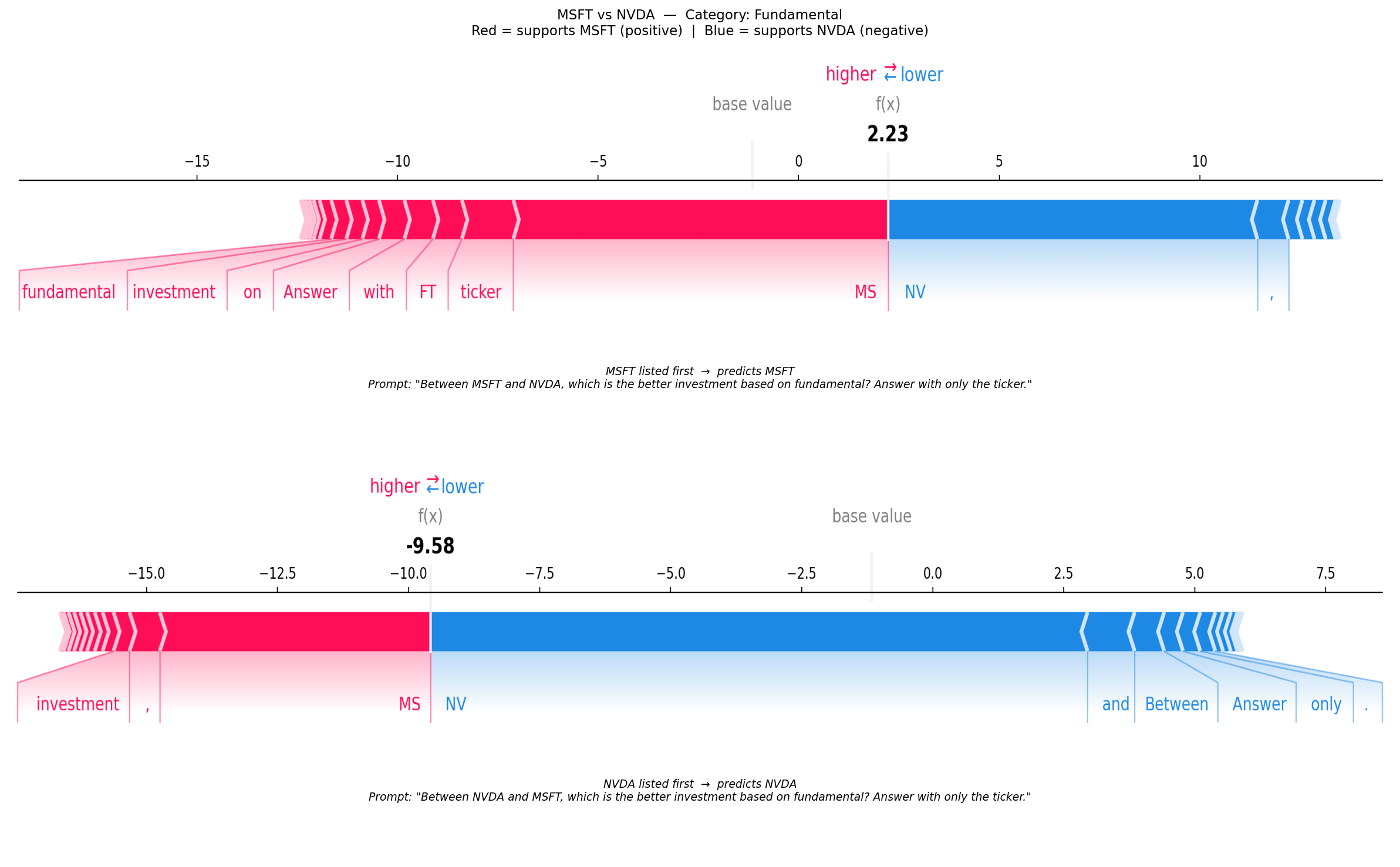
The figure shows the MSFT vs NVDA pair under the Fundamental category. The two orderings produce opposite predictions — log-odds of \(+2.23\) when MSFT is listed first (model picks MSFT) and \(-9.58\) when NVDA is listed first (model picks NVDA) — a swing of \(11.81\) log-odds units driven entirely by prompt order, not by financial content.
Note that the tokenizer splits both tickers into two subwords: MSFT → MS + FT, NVDA → NV + DA. The SHAP attributions are therefore distributed across these subword pieces.
Several patterns stand out.
The first-mentioned ticker’s subwords dominate. In the A-first plot, MS carries the largest positive attribution, strongly pushing the log-odds towards MSFT. In the B-first plot, NV takes on the largest negative attribution, pushing towards NVDA. In both cases it is the opening ticker — the one the model reads first — that drives the final prediction.
The second ticker retains a small opposing signal. MS/FT still appear as weakly positive (red) in the B-first plot, and NV/DA still appear as weakly negative (blue) in the A-first plot. The model has not lost all sensitivity to the second company; it has simply been anchored strongly enough to the first that the second ticker cannot reverse the decision.
The second token of the ticker is less influential. In both orderings, the second subword (FT for MSFT and DA for NVDA) has a much smaller attribution than the first subword, indicating that the model places more weight on the initial part of the ticker. This may reflect a general bias of the model to focus on the first token of a multi-token entity. Further analysis might be conducted to understand if this is linked to the bias at the phrase level.
The primacy effect is asymmetric.
The log-odds magnitude is larger in the B-first ordering (\(-9.58\)) than in the A-first ordering (\(+2.23\)), meaning the model is more confident when NVDA leads. This asymmetry — invisible to coarser metrics — is directly readable from the SHAP force plots and illustrates the added diagnostic value of signed, token-level attribution.
Practical Takeaways
This use case illustrates three broader lessons for deploying LLMs in high-stakes NLP domains such as finance. Even though the use case is small enough to allow easier reproducibility, the same analysis can be scaled up to larger datasets and more complex models, and the insights about positional bias are directly relevant to real-world applications. In particular, we have seen that perturbation methods transfer directly to LLMs. SHAP, introduced in Chapter 2 for tabular models, applies unchanged to language models by treating user-message tokens as features and the log-odds \(z_A - z_B\) as the prediction score. Even though SHAP analysis is computationally expensive and might only give a surface-level explanation of the bias, it provides a systematic way to identify which input tokens are driving the model’s predictions. Additionally, SHAP is model-agnostic, so it can be used as a first step to detect and understand positional bias in LLMs.
Values are illustrative. In practice, importance scores would be averaged over multiple permutation repetitions to reduce variance from a single random shuffle.↩︎